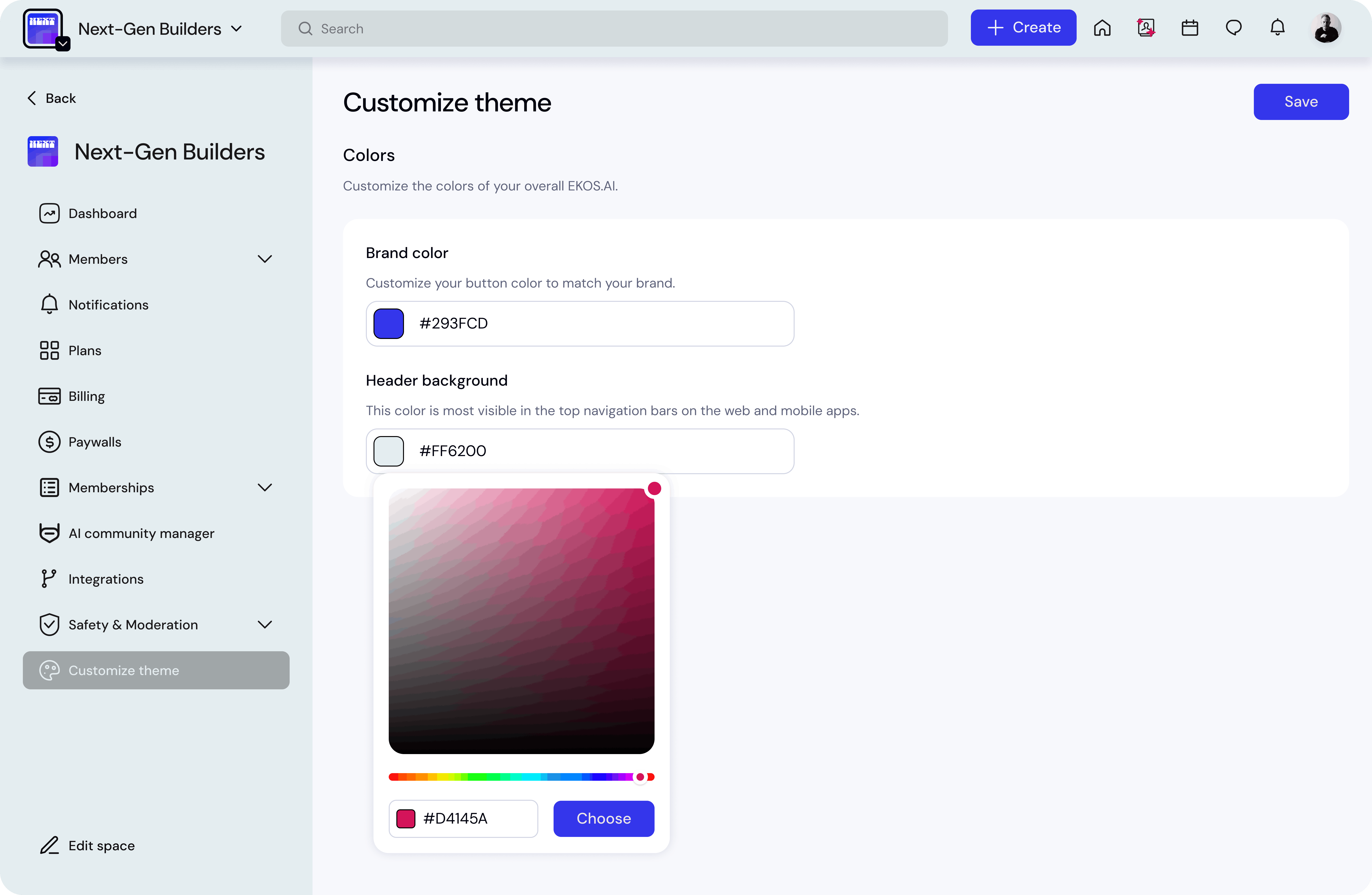
Customize Theme
Overview
You can customize the visual appearance of your community by adjusting the theme colors.
Theme customization allows you to align your community with your brand identity, making the experience more recognizable and professional for members.
Using the theme settings, you can modify:
the header background color
the brand color used across the interface
These colors are applied across both web and mobile versions of your community.
Access Theme Settings
To customize your community theme:
Open Space Settings.
Navigate to Customize theme.
Adjust your colors.
Click Save to apply the changes.
Your updates will immediately apply across the community interface.
Header Background
The header background controls the color of the top navigation bar.
This area includes elements such as:
the space name
search bar
navigation icons
notifications
profile menu
Because it appears on every page, this color is one of the most visible elements in your community.
Best practices:
use a neutral or dark color for readability
avoid very bright colors that may reduce contrast
Example: #f2f2f2
Brand Color
The brand color defines the main accent color used throughout the platform.
This color appears in:
primary buttons
highlights
UI accents
interactive elements
Using your organization’s brand color helps maintain a consistent visual identity.
You can either:
enter a HEX color code
select a color using the color picker
Example: #009DDC
Using the Color Picker
The color picker allows you to visually select your desired color.
You can adjust:
hue
brightness
saturation
Once you select the color, click Apply to confirm the selection.
Saving Your Theme
After making your changes:
Click Save in the top-right corner.
Your updated colors will be applied immediately.
Members will see the updated theme the next time they interact with the community interface.
Best Practices
Use your official brand color
This strengthens brand recognition across your community.
Maintain contrast
Ensure your header background and brand color maintain good contrast for readability.
Keep the interface clean
Minimal color changes often create a more professional and consistent experience.